


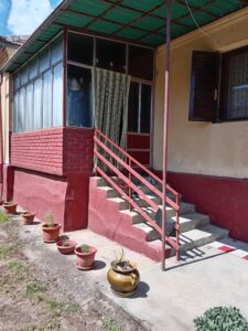
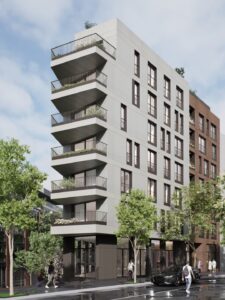


Property unit cards on real estate websites are essential for presenting listings in a neat format. They are often the first thing visitors see when exploring property options.
They offer quick details like price, photos, and basic features. They also help people sort through many listings without feeling buried in too much data. Real estate professionals arrange these cards well, making websites more pleasant.
WordPress offers many ways to include these cards. Themes and plugins let you add designs, adjust layouts, and plugin helpful features. Someone browsing for a house or apartment can skim the cards, spot interesting properties, and click for more information. This article explains how property cards work, ways to design them, and tips for making them shine on WordPress sites.
Property Unit Cards: Main Role and Benefits
Property unit cards are small boxes or sections that act as a window into each home, apartment, or commercial space. They show a photo or two, the price range, and a brief list of features. They also help a site feel tidy. Instead of having huge blocks of text for every listing, you have short previews that spark a visitor’s interest.
These cards logically guide a user. A visitor looks at a card and sees the key points—location, size, price, or even the number of bedrooms. Then, a button or link takes them to the complete listing. Real estate websites often have many listings, so property cards give structure. Each card is like an invitation to learn more.
Why They Matter
- They keep pages organized by showing listings in a grid or list.
- They save time for visitors who only need the main details first.
- They let site owners highlight essential features like proximity to schools or local amenities.
Many WordPress themes come with built-in support for these cards. You can often use a real estate plugin if the theme doesn’t include them. These add shortcodes or widgets that display listings in a card format. Some plugins even let you drag a property card element onto a page, pick the layout, and customize the colors. This keeps site owners from digging into code.
Layout Choices and Visual Design
Property cards come in a few different layouts. Some site owners prefer a grid with two or three columns. Others pick a list style that stacks property cards on top of each other. A card-based layout is popular because it presents each property in a tidy, distinct box. The choice depends on your style goals.
Key Layout Styles
- Grid Styles
- Emphasize photos
- Often show two, three, or four cards per row
- List Layouts
- Provide more text-based detail
- Let you compare features side by side without scrolling sideways
Card-Based Designs
These designs place each property in a separate box with a photo at the top, some text underneath, and a link. Each card might include a property’s name, a short subtitle, the price, and an icon or two for features like the number of bathrooms or square footage.
The visual elements often reflect the brand’s color palette or the theme’s style. Some developers add subtle design touches, such as borders or hover effects that change the card’s background when you move your mouse over it.
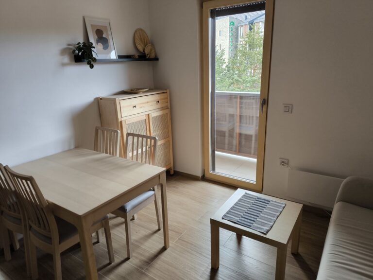
Images
High-resolution images can help. Pictures that showcase appealing features (backyards, modern kitchens, or city views) often draw clicks. Some sites go further with 3D images that let users spin the property around.
A few even use augmented reality elements, where users can hold up a phone and see a projected version of the property. That might sound advanced, but WordPress plugins exist for it. These cutting-edge tools can spark extra interest.
Technical Setup in WordPress
A smooth setup in WordPress can simplify your work. Page builders like Elementorhttps://elementor.com/ or Beaver Builder include drag-and-drop modules for property listings. With real estate themes like WpResidence, you can display property cards without juggling code. The theme links to your property database and then fetches listing data to fill each card automatically.
Many plugins or themes also include shortcodes. A shortcode is a small piece of text you paste into a page or post that tells WordPress to load property listings in a certain way. For instance, you might have [property_cards type= “house” count= “6”] to show six houses. Another shortcode might show only properties in a particular city.
Several real estate themes come preloaded with property card layouts. They might have a custom post type for properties, letting you add new listings like standard posts. You can edit the property page with advanced fields: price, location, agent name, and more. The theme then uses a default card style or gives you a few style options. This approach is good if you want a quick setup.
Filtering and Search Integration
- Filtering by region or neighborhood can help users drill down by location
- Sorting by price or date added can reveal the newest or most budget-friendly listings
- Search integration can allow users to type in special features (like “pool” or “garage”)
Filters and search tools can show results in real-time or after pressing a button to refresh the listings. This is important on large sites with hundreds of properties. People may only be interested in specific price ranges or property types. A quick filter system allows them to see only the listings that match.
Modern Design Approaches
Several trends keep property cards fresh and appealing: some designers use earthy colors or big hero images of gardens and yards, which work well for rural or suburban homes, while others prefer crisp, geometric patterns that suit sleek city apartments.
Nature-Focused Look
A property card might show a photo of a backyard or a nearby lake. A short tagline could mention a scenic porch or hiking trails close by. This style speaks to buyers who want a home with a strong outdoor feel.
Geometric and Contemporary
This approach uses sharper lines and modern typography. It pairs well with industrial lofts or new condos in busy areas and can also include strong shapes or minimalistic icons for details like the number of rooms.
Interactive Elements
3D tours let you slide around the inside of a home; augmented reality features can add an extra spark by overlaying property details on a phone’s camera feed and making users feel more connected to the listing, and while these elements require more advanced coding or specialized plugins, they can pay off by wowing potential buyers.
Best Practices for a Good User Experience
Property cards do more than display facts. They shape how people move through a real estate website. A clear hierarchy keeps essential details front and center. That might mean you show the property’s main photo or the price first, with smaller icons for extras.
Information overload is a concern. A card stuffed with every detail—bedrooms, bathrooms, square footage, school districts, agent contact data, and property history—might look messy. A short summary helps, and then the full listing page can hold the rest.
Mobile responsiveness is also vital. Many visitors look up real estate sites on the phone. A good design will adjust card layouts so they’re easy to read on smaller screens. The text remains clear, and the images fit without cutting off important parts.
Performance Tips
- Use lazy loading for images so they load only when they appear on the screen
- Compress images to reduce file size
- If you have a large number of listings, break them into pages or sections
- Limit animations that slow down older devices
Building Trust and Sharing Expertise
Property cards can build trust when they look consistent and professional, but cards missing key info or with fuzzy photos can reduce credibility; site owners can show expertise by adding small notes or tips under each property, such as listing the last renovation date or highlighting energy-saving features like solar panels or double-pane windows.
Frequent updates also help. If a property has a new price, ensure the card reflects that immediately. Real estate plugins often have automatic updates when the listing changes in the database, so you don’t need to fix the card by hand each time.
WordPress site owners can push their property cards further with custom fields and template overrides. Some advanced themes allow you to open a template file and edit the HTML or PHP that displays each card.
This requires more coding knowledge, but it provides complete control over the order of elements, the style of fonts, or the arrangement of thumbnails.
A few real estate plugins also let you track leads, log data from property clicks or form submissions, send immediate email notifications, and help you respond quickly to keep potential customers happy.
Final Thoughts
Property unit cards frame the buying journey by showing visitors a neat listings display. They combine strong visuals with key data so people can quickly decide to dive deeper. Real estate pros who build a user-friendly layout stand out from websites that bury their listings in walls of text.
A balanced design provides clarity for house hunters of all backgrounds.
The best plans pay attention to detail. High-quality images, quick loading speeds, and mobile-friendly pages keep users from getting frustrated. Minor touches like color consistency and brand fonts add a polished look. It’s also wise to keep property info accurate and up to date.
WpResidence Theme: Powerful Features
Property Card Layouts
- Choose from 7 card designs
- Pick grid or list view
- Adjust the number of cards per row and set the card height
Property Images and Sliders
- Show image sliders so visitors can scroll through photos directly on the card
- Upload placeholder images for properties with no photos
Customizable Card Content
- Pick which details to display, like price, address, or size
- Use icons, text labels, or small images to present property info
Custom Fields
- Add up to 5 custom fields for unique property data, such as lot size or amenities
- Include icons from Font Awesome or your collection
Agent Information
- Display the agent’s name, photo, or both right on the card
- Hide the agent section if you prefer a cleaner look
Show or Hide Buttons and Labels
- Turn on or off buttons like Compare Share, or Favorite
- Decide if you want to show labels for special property statuses or features
Design Custom Cards
- Pick which elements to include and arrange them as you want
- Control fonts, icon sizes, colors, and alignment to match your brand
With the WPResidence real estate theme, you can shape how property listings appear. You can display seven different card designs in a grid or list view. You decide how many cards go in each row and how tall they are. Each card can include price, address, size, and the number of rooms. You can add up to 5 custom fields for amenities or lot size details. Icons, labels, and extra photos can bring a card to life. You can also turn on image sliders so users can see multiple pictures on the card. If you want to show agent details, add their name or photo or keep it hidden.
Buttons for Compare, Share, or Favorite can be switched on or off. Even a pop-up option shows a quick preview without sending users to a new page. Fonts, colors, and icons are easily adjusted, so property cards stay consistent with your site’s branding. This approach makes each listing easy to follow and encourages visitors to learn more.
Property unit cards have a lasting impact on buyer interest. They’re more than squares filled with text. They’re a site’s first handshake with a person searching for a place to live. Well-crafted cards can increase page views, inquiries, and happier users.
Real estate professionals who care about clarity and style may see better results in the long run. If you’re aiming for a top-tier real estate site, these design and technical considerations will guide your efforts.


+ There are no comments
Add yours